top of page

Strategy: The People as the Artwork
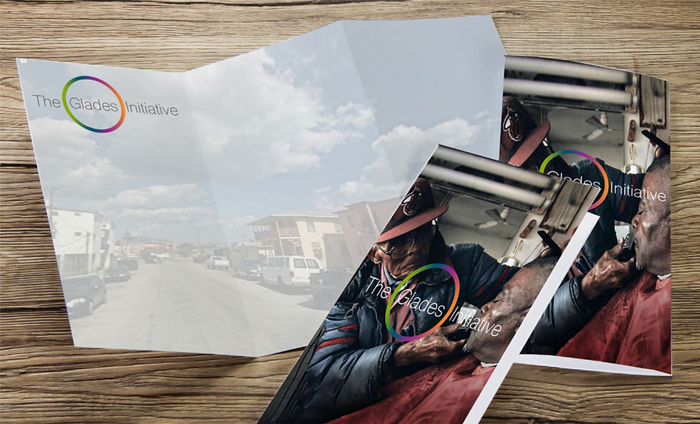
Guided by their theme line, "Our people are our fortune", we took a literal approach. The people themselves can be the artwork. We bypassed standard non-profit tropes and showcased clients with the same heroic visual reverence usually reserved for star athletes, restoring dignity and focus to the individuals the initiative fights for.
Execution
We anchored the identity with a circular logo and fluid, borderless gradients, symbolizing the continuous, evolving nature of charity and the goal of bringing clients "full circle" to self-sufficiency. We brought this to life across a highly resourceful campaign:
Video Mini-Biographies: Embracing our production constraints, we created powerful video profiles through intimate photoshoots, raw narrated stories, and evocative sound design to give each client's journey cinematic weight.
Environmental Installations: We turned clients into literal visual installations, wrapping the windows of local facilities with their heroic portraits. Set against the visually bland, run-down backdrop of the neighborhood, these vibrant circular graphics stood as unmistakable beacons of hope.
Campaign & Collateral:
Every photographic asset paired heroic portraiture with subversive copy (e.g., "HE ENJOYS VEGETABLE GARDENING. IT'S NOT A HOBBY; IT'S SURVIVAL."). This polished approach elevated event flyers and narrative-driven donor letters, giving funders a tangible, emotional connection to the community.




Full Circle
Creating a brand identity for The Glades Initiative
My Role
Lead Brand Strategist, Conceptual Lead, Creative Director, Art Direction.
The Challenge
The Glades Initiative serves Florida's poorest communities. Operating with zero budget for this pro bono project, we had to execute a gritty, "run-and-gun" brand overhaul without sacrificing strategic creativity or polish.
bottom of page